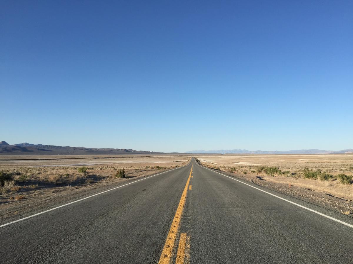
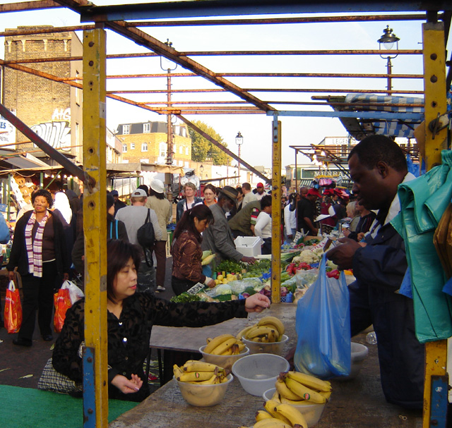
Humans are a travelling species. Evidence from the earliest human communities demonstrates that people have not only journeyed around, but also traded goods with other, distant communities. In fact, through human ingenuity and adaptability, we have managed to populate almost all land-based ecosystems on the planet. There is almost no land left untouched by human hands. This has not only given rise to our globalised and interconnected world but made it so that, regardless of which locality we find ourselves within, we will certainly be surrounded by products made from all around the world. Not only this but as our communities change, the people we encounter, day by day, come from places both familiar and unconsidered. Some in transit, others relocated, and others yet on course for a more nomadic lifestyle.
Our imaginations go into overdrive when we stop to wonder how many people travel nowadays?
Even strictly quantitatively, this is a very difficult question to answer.
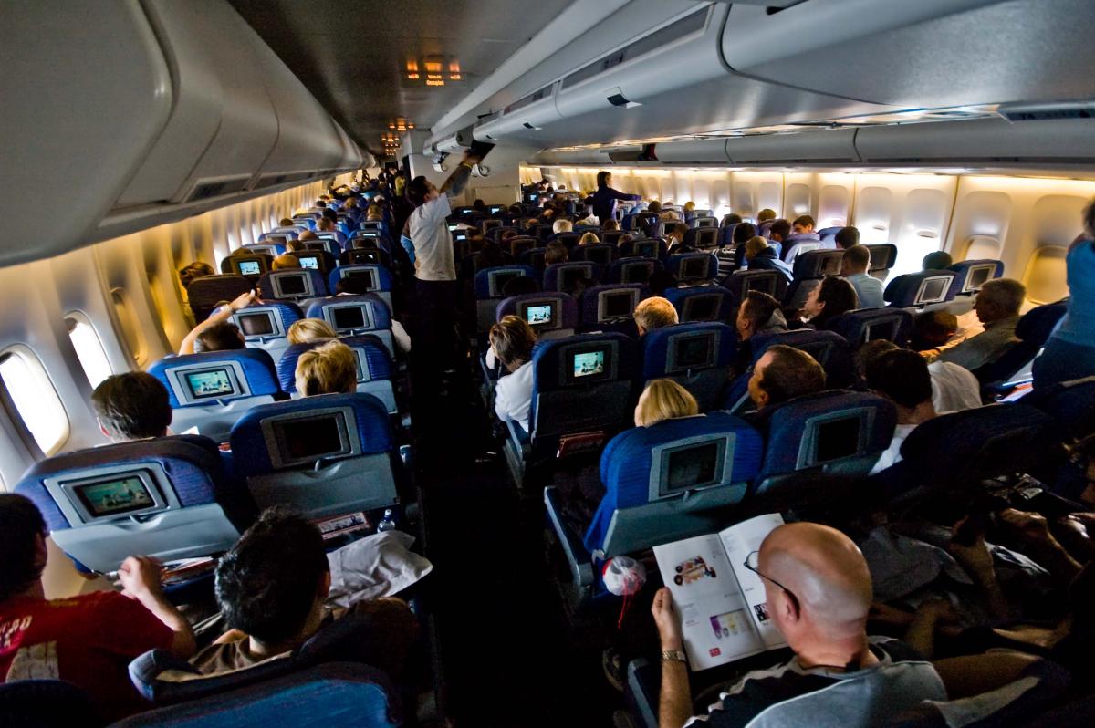
Mobility, in its simplest form, aims to measure transfers over time. But we can focus on geographical mobility, encompassing the movement of peoples and goods, or human mobility, migration within any given population. Yet, attempts to estimate the number of people travelling at any given point does not provide a lot of information. We cannot distinguish between journeys undertaken for necessity, business, work, or pleasure. Impacts of tourism, for instance, must also be determined. According to the International Air Transport Association (IATA) and the International Civil Aviation Organization (ICAO), 4.5 billion people fly annually. At the moment, there is no indication as to how many of these travellers are tourists or migrants.
If we focus on migration, we can start with where people emigrate from. In the following map we can see those countries with the most emigrants from 1990 to 2020. These are absolute figures and, logically, countries with larger populations are on top. Scores are measure in the thousands.
Source: Our World in Data
And when we focus on immigration, a similar higher concentration of mobility is witnessed in a select few countries. The total figures (measured in the thousands) show the highest levels of immigration, particularly in the US and Germany. Yet, Russia also hosts a large population of immigrants, many drawn from the former, neighbouring soviet republics. Likewise, the Monarchies of the Persian Gulf, especially Saudi Arabia, maintain high numbers of immigrants.
Source: Our World in Data
When we explore the countries with the highest arrival of immigrants, in relative terms, we find both a surprising and predictable result. If we look at the top 16 countries, where the influx of immigrants has the largest percentage compared to their own population, we witness a common feature. They are rich, small (even tiny) states. Places with a lower population tend to welcome three types of immigrants: unskilled workers to take on the unqualified jobs, highly skilled professionals for the top positions, and rich individuals seeking a tax haven for their wealth.
Source: Our World in Data
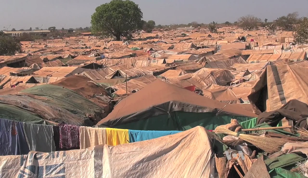
But refugees tell a different story.
The 1951 Refugee Convention states that a refugee is a person that ‘owing to well-founded fear of being persecuted for reasons of race, religion, nationality, membership of a particular social group or political opinion, is outside the country of his nationality and is unable or owing to such fear, is unwilling to avail himself of the protection of that country; or who, not having a nationality and being outside the country of his former habitual residence as a result of such events, is unable or, owing to such fear, is unwilling to return to it’.
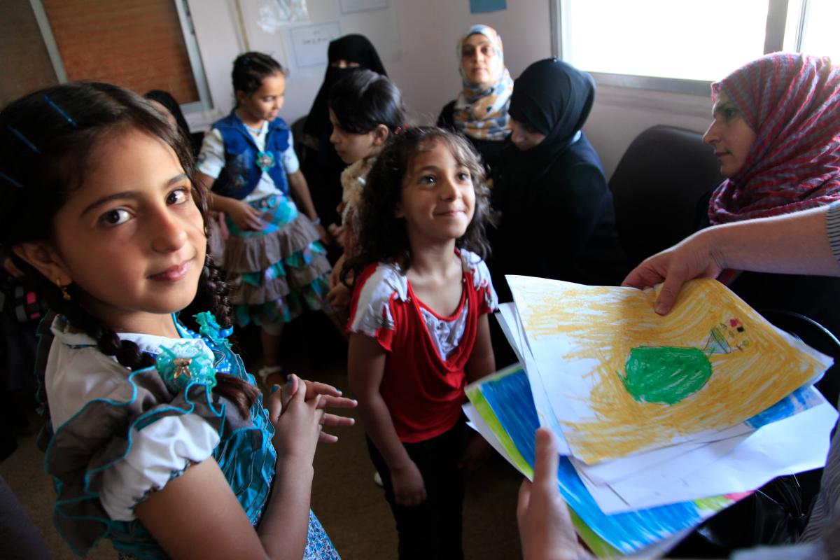
Multiple sources of pain and suffering over the last 55 years are revealed with a quick examination of the countries that refugees have been fleeing from. And, as procedures for registering and counting refugees becomes more sophisticated, we are also seeing a steady total increase in refugees. In all likelihood, due to the sensitivity of this topic in certain contexts, the real figures are probably much higher.
This graph ranks the countries with the highest number of people who have fled their borders, seeking refuge elsewhere.
Source: Our World in Data
Looking at those countries where refugees seek asylum, we can see the other side of these movements and develop a more complete picture. Although many wealthy countries have a tradition of sheltering refugees, particularly those with a colonial past, it is worth noting that most refugees can barely make it to a neighbouring country. In this regard, the constant flow of fleeing Palestinians to Jordan and Lebanon or, more recently, of Syrians to Turkey and Lebanon is noticeable. Frequently, these receiving countries do not have the resources to properly host the newcomers or guarantee their safety.
Interesting to note, those rich countries that lead the immigration rankings and seem to welcome so many visitors and workers, often lack noticeable figures specifically related to refugees.
Source: Our World in Data
Another index shows the full dimension of this human tragedy: the number of refugees as a proportion of the total population of the asylum-granting country. The data here measures the number of refugees per 100,000 local population. To paint the full picture, most of the top sheltering countries are poor or very poor states. These less-than-well-off countries appear to demonstrate a greater capacity for generosity than their richer, more able, counterparts.
Source: Our World in Data
And this next graph reaffirms that observation. The greatest effort to help refugees is largely undertaken by the poorest countries. In comparative terms, the more wealthy countries are doing only a fraction of what the poorer countries are doing.
The figure indicates the number of refugees per 100,000 local population.
Source: Our World in Data
The situation became grave as some European countries are actively working to outsource asylum for their refugees. The UK 2021 Nationality and Borders Bill laid the groundwork for asylum seekers in the UK to be transferred to other British Overseas Territories or, even, third-party countries. At the moment, the Bill is waiting for a court to decide on its legality. If it is approved, the law will prevent refugees from staying in Britain while their asylum application is processed.
Denmark has gone one step further as it already passed a 2021 law to process asylum seekers outside its own borders, despite opposition from both the UN and the European commission.
To appreciate the complexity of human mobility today, we must go beyond immigration and refugees to see the impact tourism has on this trend. This graph shows the evolution in the number of air passengers carried. In 1970, there were 350 million travellers, by 1990 this number had risen to 1,062 million. In only 16 years, the figure doubled and by 2019 over 4.5 billion travellers were recorded. Despite the pandemic’s abrupt disruption of air travel, the number of air travellers is again on the rise. If not in 2023, by 2024, we will probably see a return to air travel setting new records year after year.
Source: Our World in Data
Image by Iconjam at Flaticon
In the next trend we will analyse, in greater detail, the impact of tourism on human mobility, a more general reflection on geographical mobility, and the environmental costs – and risks – of both. We will ask if our predisposition for mobility is sustainable in postnormal times?